DESIGN SYSTEM
Brand Guidelines
Design system and visual identity for The Influence Quotient — intelligence-led political analysis.
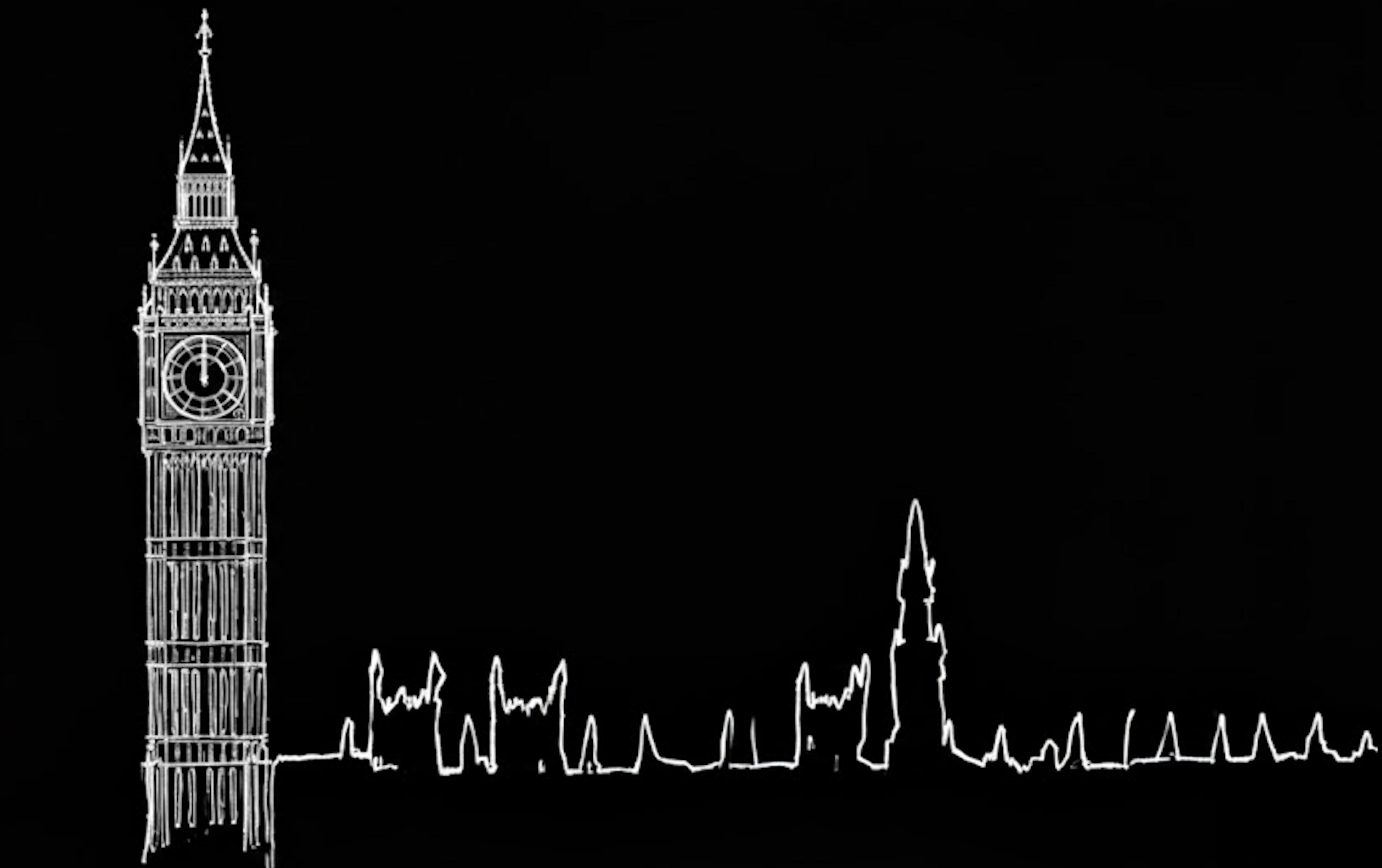
Brand Identity
Logo
Dark background (primary usage)

With brand name
The Influence QuotientGold Masthead Accent
A thin gold gradient line appears at the top of every page and in email templates. It is the signature brand element.
background: linear-gradient(90deg, transparent 5%, #C9A84C 50%, transparent 95%)
Colour Palette
Core UI Colours
Colours are defined as HSL CSS variables in globals.css and mapped through Tailwind in tailwind.config.ts.
Background
#050709
hsl(220 20% 2%)
Card
#0A0D14
hsl(220 20% 4%)
Secondary
#131A26
hsl(220 25% 10%)
Muted
#181D27
hsl(220 20% 12%)
Border
#1E2533
hsl(220 20% 14%)
Accent Gold
#C9A84C
Primary
#C9A84C
Editorial Blue
#3B82F6
hsl(217 91% 60%)
Destructive
#7B1D1D
hsl(0 62% 30%)
Accent Gold
Gold is the primary brand accent. Used for CTAs, section numbers, hover states, the masthead line, and interactive highlights.
Accent Gold
#C9A84C
var(--accent-gold)
Tailwind: accent-gold
Market & Trading Colours
Market Gain
#10B981
Market Loss
#EF4444
Market Neutral
#6B7280
Market Blue
#1E40AF
Market Navy
#0F172A
Political Party Colours
Labour
#DC241f
Conservative
#0087DC
Liberal Democrat
#FDBB30
Green Party
#02A95B
Reform UK
#12B6CF
SNP
#FFFF00
Sinn Féin
#326760
Plaid Cymru
#005B54
DUP
#D46A4C
Alliance
#F6CB2F
Independent
#888888
Speaker
#006548
Typography
Font Families
Playfair Display
font-headingThe quick brown fox jumps over the lazy dog
Loaded via next/font/google as --font-heading. Used for all headings (h1–h6) and display text. Weights: 400, 700, 800.
DM Sans
font-bodyThe quick brown fox jumps over the lazy dog
Loaded via next/font/google as --font-body. Used for body text, buttons, UI elements, and navigation labels. Weights: 400, 500, 700.
Cinzel
font-monoThe quick brown fox jumps over the lazy dog
Accent font used for brand elements, section numbers, navigation items in the header, and the page title on the brand guidelines page. Loaded via Google Fonts CSS link.
Heading Hierarchy
H1 — Main Page Titles
H2 — Section Headings
H3 — Subsection Headings
H4 — Card Titles
H5 — Minor Section Headings
H6 — Small Headings
Navigation Typography
Header navigation uses Cinzel at 11px with wide letter-spacing and uppercase transform, matching the editorial intelligence brand.
font-mono text-[11px] font-medium tracking-[0.2em] uppercase
Buttons & Interactive Elements
Button Variants
Default Buttons
Button Sizes
Brand CTA Buttons
Gold accent buttons for primary calls to action.
Trading Buttons
Badges & Status Indicators
Badge Variants
Standard Badges
Market Status Badges
Political Party Badges
Alerts & Notifications
Alert Components
Information
Error
Success
Form Elements
Input Components
Newsletter Capture Style
Used in the IQ Briefing section — dark input with gold focus ring.
Background & Texture
Noise Texture Overlay
The body background includes a subtle SVG noise texture at 3% opacity, applied via globals.css. This gives the dark background a tactile, film-grain quality.
With noise texture (actual)
Flat background (for comparison)
Section Backgrounds
Default
bg-background
Secondary Section
#080B12
Briefing Section
#0A0A0A
Why Dark by Default
The dark navy palette is a deliberate editorial choice, not a default. It signals the product's category — a terminal for political intelligence, closer to a trading desk or an analyst's screen than a consumer news site. It keeps the eye on the data: gold accents, party colours, and market signals read with maximum contrast against a near-black ground, and the graph in The IQ Network sits in darkness so the influence map itself is the only thing that glows.
Dark also reflects how the audience works — Westminster staffers, journalists, and analysts scanning briefings early and late, often for long stretches. A low-luminance interface reduces eye strain in those conditions and treats sustained reading as the primary use case.
Light reading mode (opt-in)
Usage Guidelines
Do
- • Use
font-heading(Playfair Display) for headings - • Use
font-body(DM Sans) for body text and UI - • Use
font-monofor brand elements and navigation - • Use
accent-gold(#C9A84C) as the primary brand accent - • Use semantic colour tokens (market-gain, market-loss)
- • Use HSL CSS variables for core UI colours
- • Use political party colours from the design system
- • Maintain the dark navy background aesthetic
- • Include the gold masthead line on all pages and emails
Don't
- • Don't use
font-robotoorfont-merriweather— these are not in the codebase - • Don't create custom colours outside the design system
- • Don't use light/white backgrounds for primary layouts
- • Don't mix font families inappropriately
- • Don't use destructive styling for positive actions
- • Don't compromise accessibility for aesthetics
- • Don't ignore responsive breakpoints
- • Don't use the logo without adequate surrounding space
Technical Reference
Key Files
src/app/globals.cssCSS variables, base styles, noise texturetailwind.config.tsColour tokens, fonts, animations, party colourssrc/app/layout.tsxFont loading (Playfair Display, DM Sans)src/components/ui/shadcn/ui base components (Radix UI)Voice & Tone
Voice Samples
Three example paragraphs in the IQ voice — data first, dry confidence, wit where it earns its keep.
“The IQ Desk scores Farage at 34/100 — limited current influence, trending up. Media presence and electoral position do the lifting; the absence of any front-bench role caps it. The number is the point; the sentence is the courtesy.”
“Reform's polling has risen for six straight months. Its influence has not. The score reflects the gap between being talked about and being able to move a vote.”
“Streeting up four points on conference rumours. Worth a long position if you read the FT this morning — and a short one if you only read the tweets.”
Voice Rules
- • Data first, verb second, consequence third.
- • Dry, confident, knowing — never tabloid.
- • Wit allowed; hype not.
- • British spelling, British register, British subject.
- • A person is behind it: The IQ Desk.
Banned Words
These words do not appear in IQ copy. If you find yourself reaching for one, rewrite the sentence.
Do / Don't
Do
- • Methodology in public.
- • Editorial review before publication.
- • One source of truth.
- • Correction policy.
- • British subject, British standards.
Don't
- • No spin, speculation, “could”, “might”, or “sources say” unless named.
- • No black-box authority.
- • No gamified bravado.
- • No fabricated social proof.
- • No unbacked engineering claims.
- • No party colour as brand chrome.